Feature #991

Playlist drag and drop position indicator for Qt UI?
100%
Description
When dragging files around in the Qt UI's playlist, there's no visual indicator of exactly where the tracks will be dropped. Obviously you know about where they'll go, but having a little line inbetween the rows to indicate where it'll be placed helps out (especially when dragging a bunch of tracks at once). Qt doesn't make that entirely straightforward -- I've had to do this for a couple PyQt apps of my own, but my solution is basically this:
https://stackoverflow.com/questions/7596584/qtreeview-draw-drop-indicator
That's always felt rather hokey to me, but it does the trick. An example from an app of mine: http://apocalyptech.com/linux/qt/qtableview/qtableview.png - the black line indicating that it'll be dropped inbetween the two bottom rows.
History
#1
 Updated by Thomas Lange about 6 years ago
 Updated by
 - File VisibleIndicator.png VisibleIndicator.png added
If the indicators are visible is probably related to the theme / Qt version / desktop environment you are using.
I see them on my setup and they look similar to your example.
#2
 Updated by CJ Kucera about 6 years ago
 Updated by
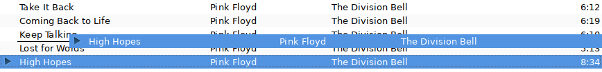
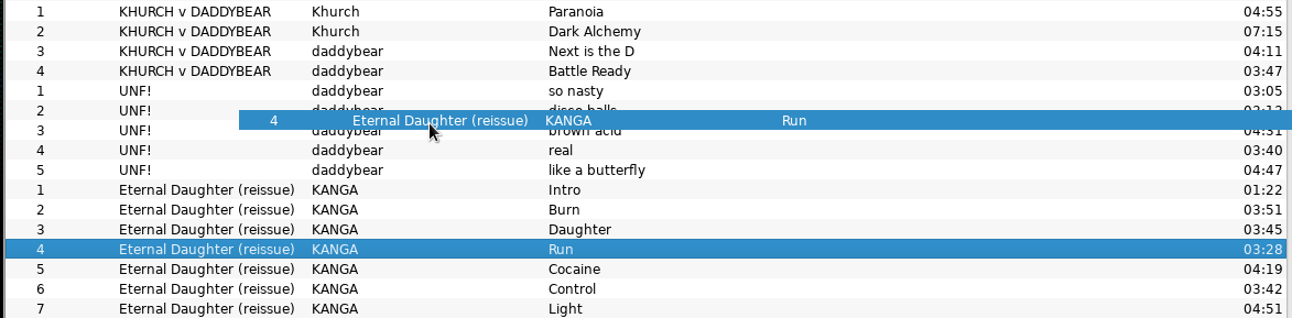
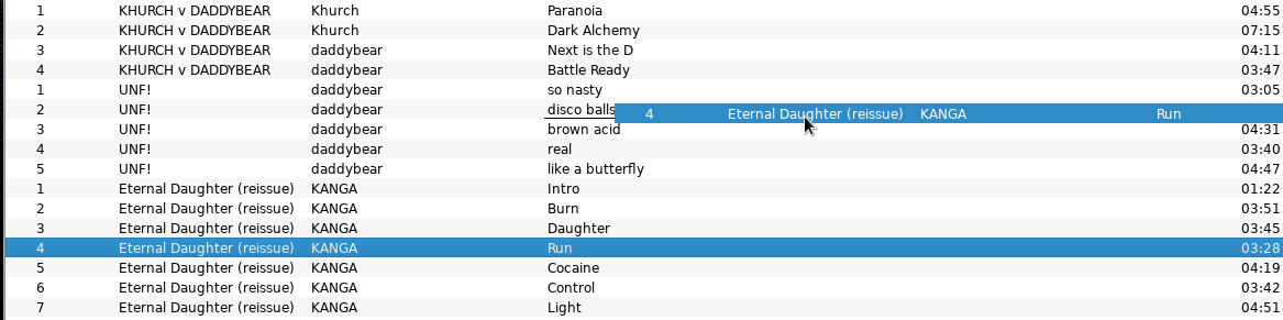
 Ahh, okay, I see that there is a line being drawn underneath the actual cell you're hovering over. So part of what I suppose I'm asking is if that line could be extended across all columns. As it is, being able to see that line at all depends greatly on both where you've grabbed the row, and where you're hovering. It seems I tend to grab near the album name, and if I'm hovering over any of my first few columns, that underline is basically never (or at least very rarely) visible (see aud1.png). If I move it all the way over to the track names, then yeah, I can definitely see the line (see aud2.png). Alternatively, if I grab the row near the very front of the row (where I have the track number), it'd be more obvious, so I could certainly just start doing that, now that I know the line's there.
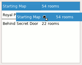
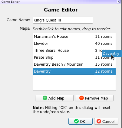
It'd be pretty nice, IMO, to have the line drawn across the whole row, though, and that's what the example does up there. As one more example based on that app of mine again, If I've grabbed on the "map name" but I'm hovering it over the "room count" column, I still get the position indicator clearly visible. (That's map.png)
Grabbing near the start of the row is certainly a perfectly acceptable workaround, of course, so I'm happy to just do that from now on. IMO it'd still be nice to extend it out, though. :)
Cheers!
#3
Updated by Thomas Lange about 6 years ago
- File treeview.patch treeview.patch added
Thanks for the insights. The attached patch is based on the solution from StackOverflow.
@John, Ariadne: Do we want to merge this? Does it look correctly on macOS?
#4
 Updated by John Lindgren about 6 years ago
 Updated by
 I don't have a strong opinion one way or the other.
#5
Updated by John Lindgren over 5 years ago
- % Done changed from 0 to 100
- Status changed from New to Closed
I've applied this patch for 4.1. Thanks all!
#6
Updated by Thomas Lange over 5 years ago
- Target version set to 4.1
